The Lab
February 24, 2026

Do Your Homework on Every Spike Cycle

Pick a vol or inverse ETF. The Spike Analyzer's Cycle Analysis mode opens up every cycle in the ticker's history (ATL → peak → new ATL) and lets you step through them one at a time: chart, peak stats, pullback histogram, full pullback log.

Trading a vol or inverse ETF mid-spike without studying its history is the trading equivalent of buying a car you've never sat in. UVXY alone has 85 completed spike cycles in its history. Each one is a complete story: a fresh all-time low, a rally to some peak, a series of pullbacks along the way, and a final reset back to a new ATL. Knowing how many pullbacks the typical UVXY cycle has, how deep they tend to be, and how long the whole episode usually lasts is the difference between sizing a position with conviction and panic-clicking on every red bar.

That's what the Spike Analyzer's Cycle Analysis mode is for.

Step through every cycle

Spike Analyzer Cycle Analysis showing the cycle dropdown, ATL details, spike details, pullbacks-from-peak histogram, cycle chart, and pullback log table

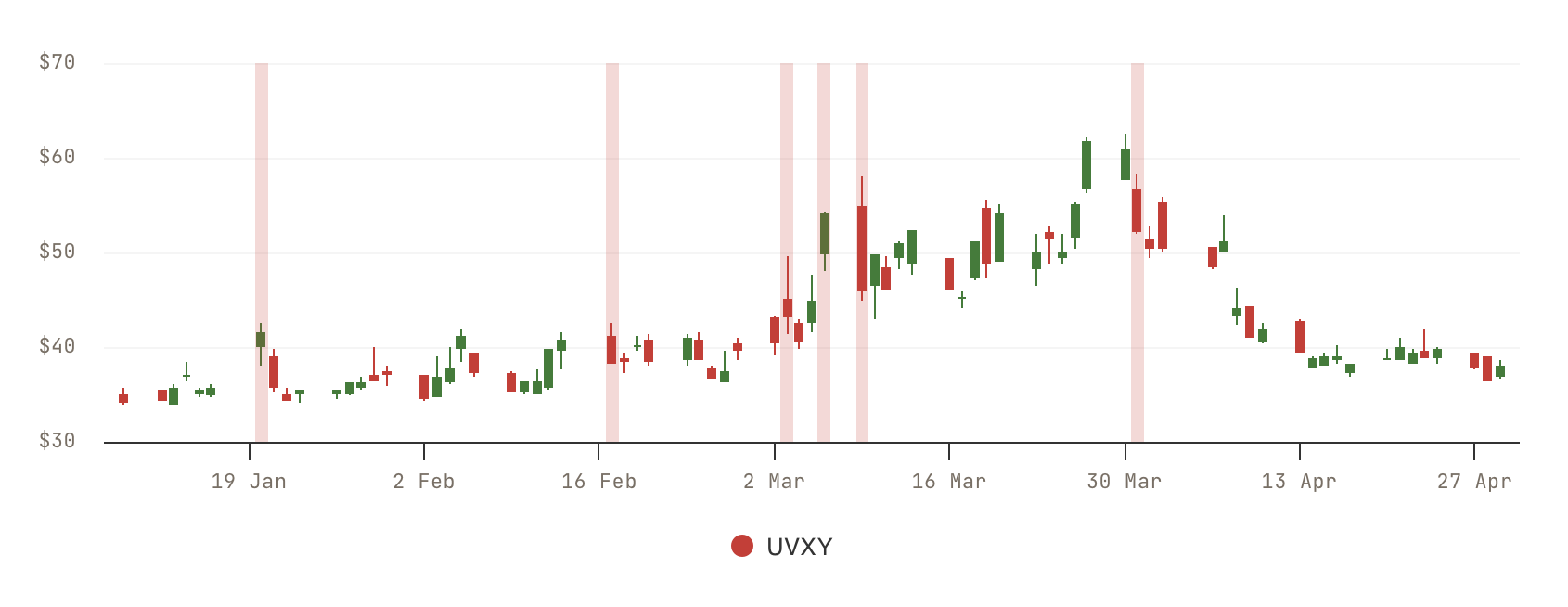
Pick a ticker (UVXY, UVIX, VXX, SQQQ, SOXS, ZSL, BOIL up front; DUST, FAZ, GLL, LABD, SCO, SPXU, TSLQ, TZA in the More dropdown). Switch to Cycle Analysis. The dropdown opens up every cycle in the ticker's history with a date range and the peak spike size, e.g. "Apr 14 to Sep 8, 2024 (+167%)". Click any cycle. The whole results card re-populates with five things, top to bottom.

First, ATL Details: the ATL price that anchored this cycle, the date it printed, and how many trading days the cycle lasted. Then Spike Details: the cycle's high price, the peak spike percentage off the ATL, the current spike (relevant on the live cycle), and the biggest single pullback in the cycle. Then Pullbacks From Cycle Peak: a row of counts at every threshold (how many drops of ≥10%, ≥15%, ≥20%, ≥25%, ≥30%, ≥40%, and ≥50% happened in this cycle from the eventual peak). Then a chart visualizing the rally with the pullbacks marked. And finally a Pullback Log table listing every peak-to-trough event with peak price, peak date, trough price, trough date, drop percentage, and recovery (or "still down" if it didn't bounce back before the cycle ended).

A cycle that had four 20%-plus pullbacks on the way to its peak is a different beast than one that topped on the first 10% dip. The dropdown lets you walk through all of them in five minutes.

What's in each cycle's report

Six surfaces. The dropdown lets you flip between cycles in one click; the rest re-populates instantly.

Selector

Cycle Dropdown

Every cycle in the ticker's history listed with date range and peak spike. Click to load. UVXY currently has 85 cycles, the oldest going back to 2011. The selector includes the live cycle marked CURRENT.

ATL Details

Anchor Stats

Three readings: ATL Price (where the cycle started), ATL Date, and Days Since ATL (how long the cycle has been running, or its full duration if completed).

Spike Details

Peak Stats

Four readings: Cycle High Price, Cycle High Spike (the peak as % above the ATL), Current Spike, and the cycle's Biggest Pullback (largest single peak-to-trough drop).

Pullbacks

Threshold Histogram

Counts at seven thresholds: ≥10%, ≥15%, ≥20%, ≥25%, ≥30%, ≥40%, ≥50%. Tells you in one glance how many real drawdowns the cycle absorbed before topping or while still climbing.

Chart

Cycle Visualization

The rally plotted from ATL through the cycle's progression. The peak and pullbacks are visible against the curve so you can see the shape, not just the count.

Audit

Pullback Log Table

Every meaningful pullback in the cycle as a row: peak price, peak date, trough price, trough date, drop %, and recovery (or "still down" if the cycle ended before recovering). Useful for spotting how long pullbacks usually last before the rally resumes.

How a "cycle" is defined

A cycle is a complete round trip in the ticker's price-history math: it begins on a bar that prints a fresh all-time low, runs through whatever rally follows, and ends when the ticker prints a new all-time low that erases the prior anchor. That's it: one ATL → next ATL.

This framing matters for vol and inverse ETFs specifically because their structural decay means new ATLs eventually print on every product on this page. Each cycle is a finite, self-contained event. The 85 cycles in UVXY's history are 85 independent stories you can read.

Inside each cycle, the tool tracks the highest price reached (the cycle's peak) and walks bar by bar identifying every meaningful peak-to-trough drawdown. Those are the pullbacks. The threshold histogram and the Pullback Log are just two views of the same per-cycle pullback list. The histogram is the count summary, the log is the row-by-row detail.

For comparison, the tool's other mode (Spike Analysis) aggregates across every cycle that hit a chosen spike threshold and reports the typical pattern (how often the spike happens, how long it usually takes to decay). Spike Analysis is the bird's-eye summary; Cycle Analysis is the ground-level walkthrough this article is about.

Your Homework Checklist

Five Cycle-Analysis exercises that prepare you for the next spike before it starts.

1

Walk every UVXY cycle

Open UVXY in Cycle Analysis. Click through all 85 cycles in the dropdown and note for each one: peak spike percentage, number of ≥20% pullbacks, and total cycle duration. You'll finish with a printable feel for UVXY's "typical" cycle and a sense of where the outliers live.

2

Find the "topping pullback" depth

For every completed cycle, look at the Pullback Log and find the final entry. That's the drawdown that took the cycle to a new ATL. Note the percentage. Across enough cycles you'll see a distribution: some products top on a 20% drop, others need a 40%+ rollover.

3

Calibrate stops by the histogram

Long during a rally? The pullback histogram tells you how many ≥10% / ≥20% / ≥30% drops a typical cycle absorbs while still climbing. A 10% stop you set on day three would have been hit in most of UVXY's cycles. The histogram sets your honest expectation.

4

Compare across products

Run the same homework on UVXY, UVIX (2x), VXX, SQQQ, SOXS, ZSL, BOIL. Their cycles look fundamentally different. UVXY's pullbacks aren't SOXS's pullbacks. The Cycle Analysis dropdown makes the comparison concrete instead of "I think it feels different."

5

Study the outlier cycles

Find the cycle with the highest peak spike, the longest duration, and the most pullbacks. What were they trading through? The outliers tell you about worst-case holding periods, best-case quick fades, and the macro environments that produce abnormal spike behavior.

Start Your Homework

Open the Spike Analyzer, switch to Cycle Analysis, pick UVXY, and step through the 85 cycles. CI Volatility members can flip between any cycle in any ticker; free users see the live cycle on the default ticker.

Open the Spike Analyzer

Comments

Loading comments…